When you click the Analyze button above your substance search results, it will take you into our Analyze section.
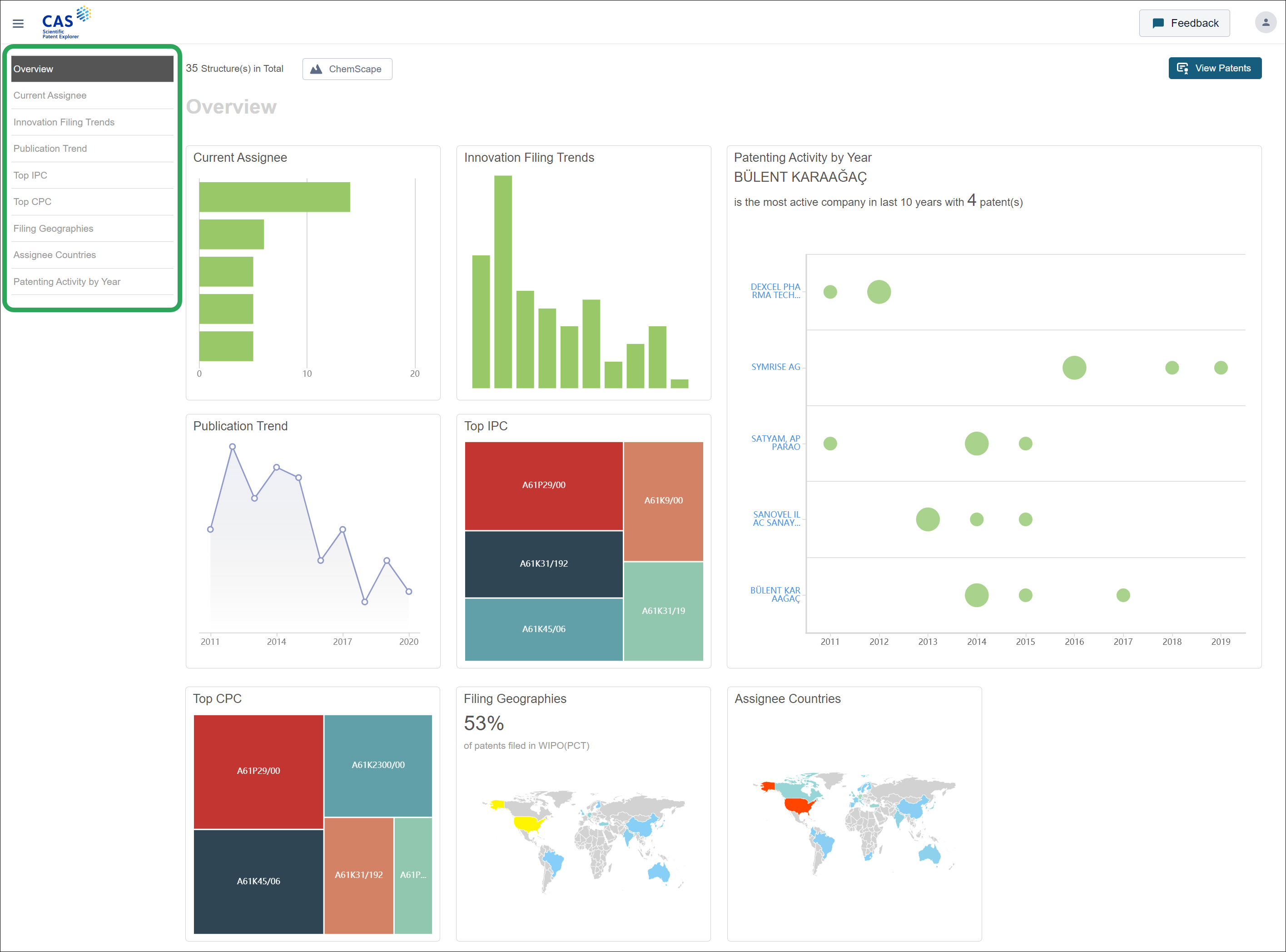
The Overview page presents a high-level snapshot of your results in the form of 8 charts/graphs. Clicking a chart/graph or its name in the left-hand menu displays a more in-depth view:
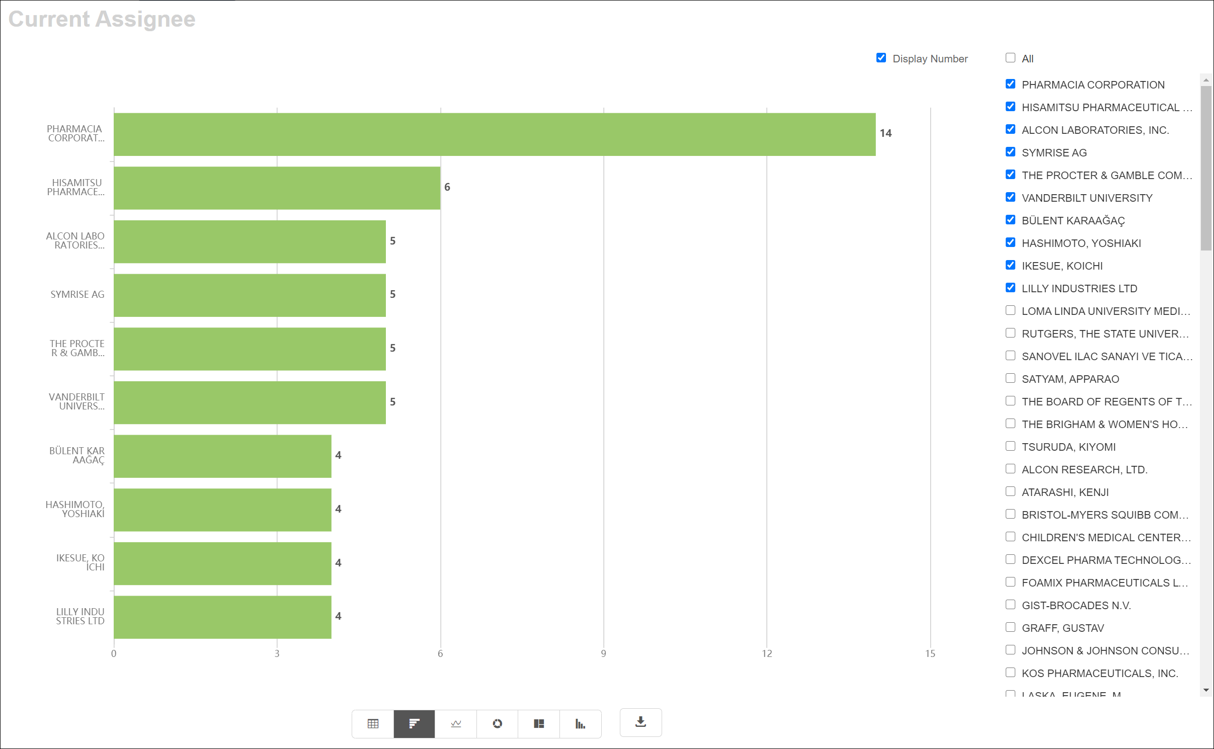
This graph shows the current assignees for patents associated with your substance results. This is critical information to have since it enables you to work out which are the companies that are most active within your field of interest. You can also make plans to work out how to combat these potential competitors or steer clear of them altogether. Furthermore, you could select assignees to get an even stronger idea of who is operating within your space of interest.
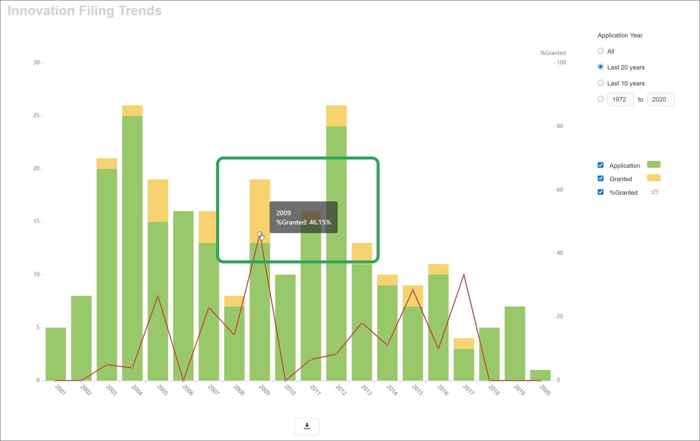
This graph gives you an insight on the filing trends for patents associated with your substance results by showing the ratio of patent applications to granted ones. The green bar shows the number of applications per year above which is a yellow bar that indicates the number of these applications that were granted over the years. The red line represents the percent of patent applications granted for a given year.
It should also be noted that if a patent application has been granted then it will be shown as both an application and a granted patent for the year that it was filed.
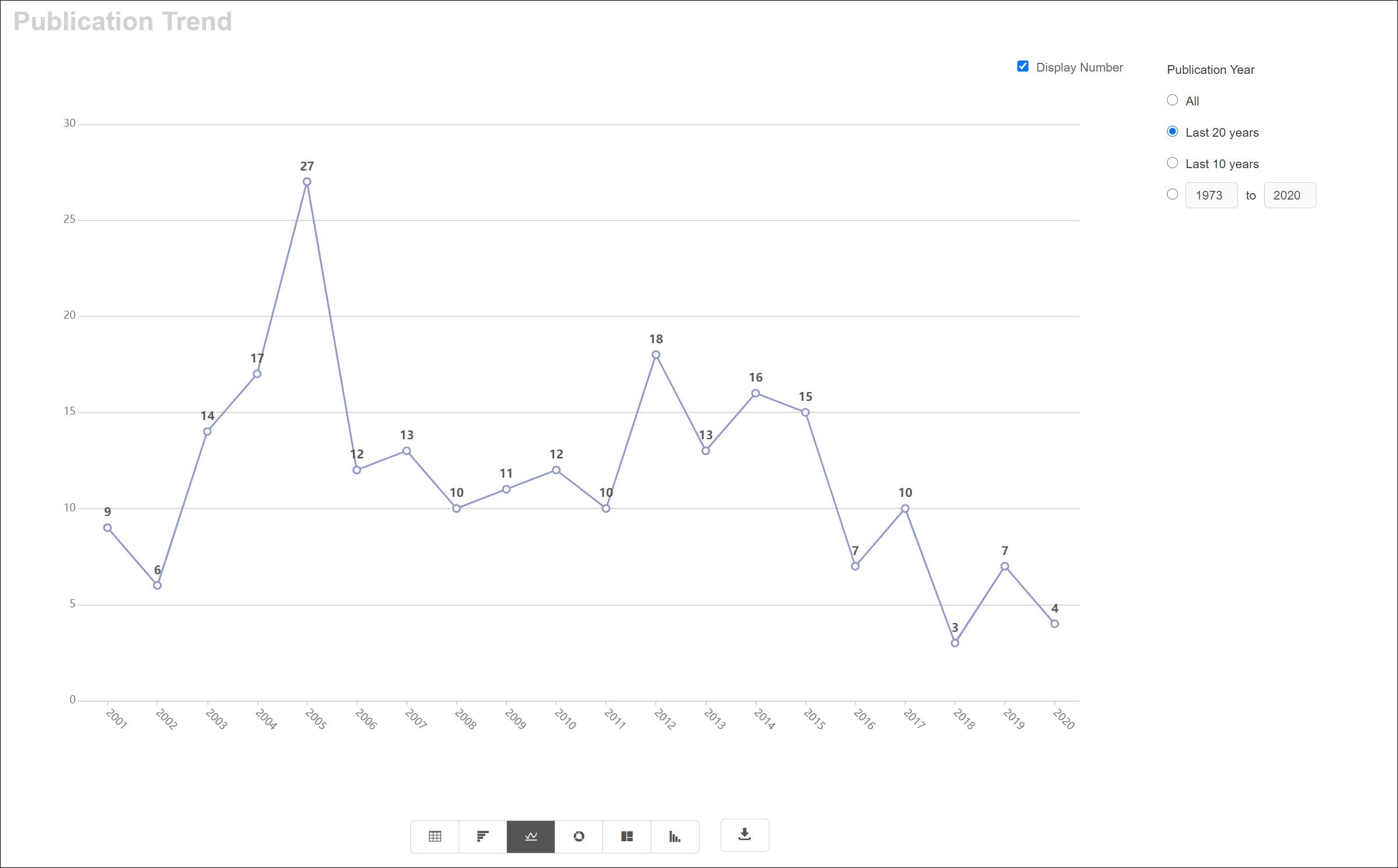
This graph shows the Publication Year for patents associated with your substance results.
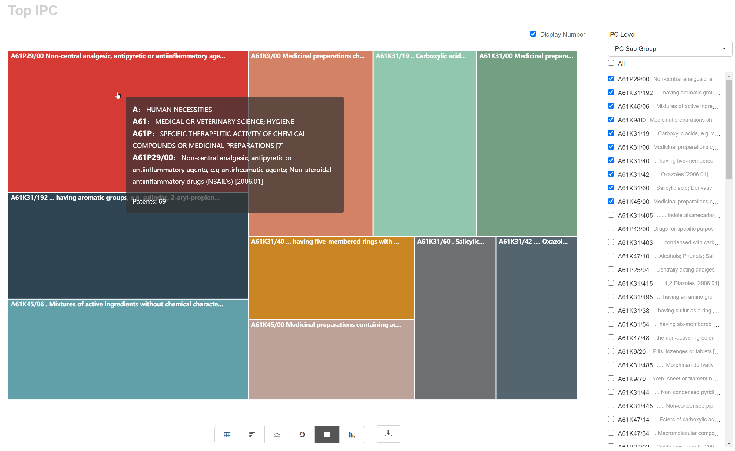
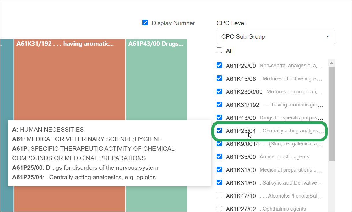
This graph shows the most common IPCs for patents associated with your substance results. If you are searching for a particular competitor's portfolio, this chart displays the technology fields that they are focused on. Thus, you can plan to either work against them in these particular fields or avoid them altogether.
You can also select multiple IPCs to get a more holistic view of your competitor's portfolio and see some of the more abstract areas they are working in. Additionally, you can select the level of IPCs you want to view the IPCs from, which means you can have a more general view of the technology fields that they are working in.

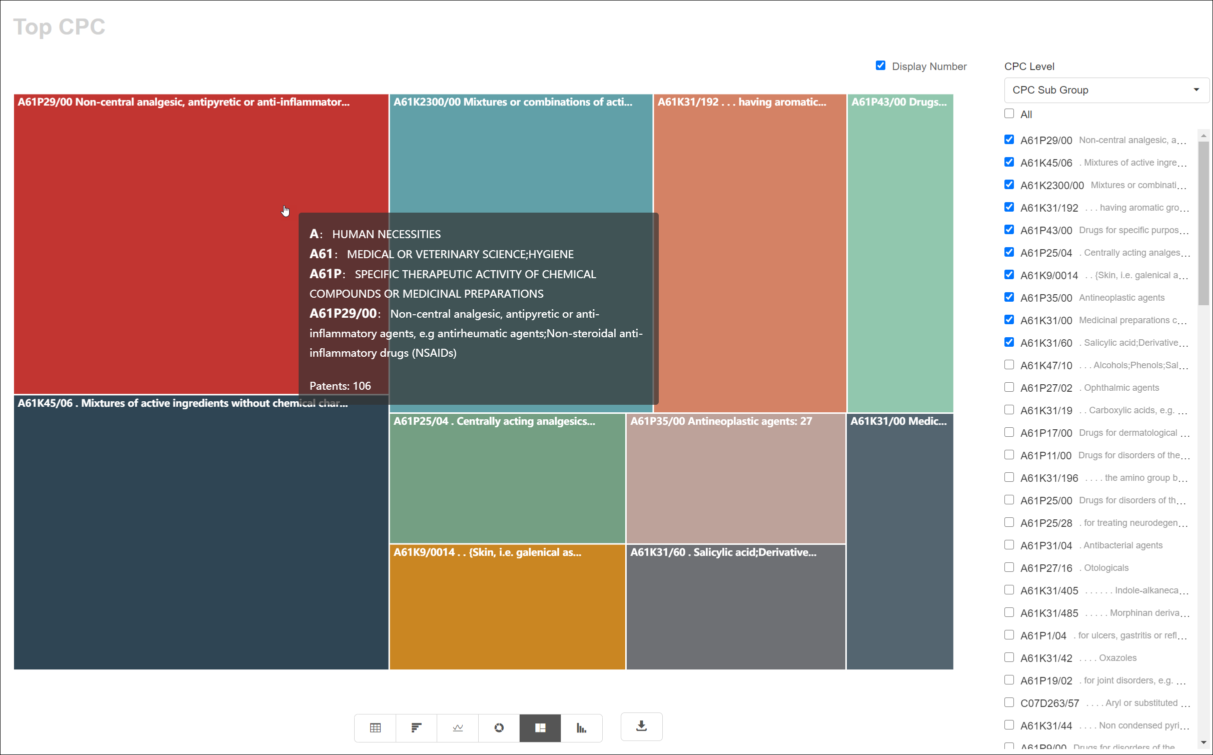
This graph shows the most common CPCs for patents associated with your substance results. Like IPCs, CPC is a type of classification code so the reasons for Top CPC chart would be the same as the IPC chart. However, you may prefer CPCs over IPCs since they are more up to date and include newer technologies.
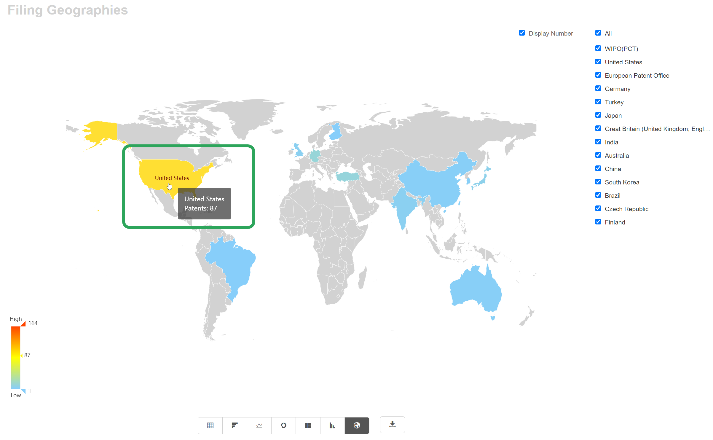
This chart shows the countries where applications were filed for patents associated with your substance results.
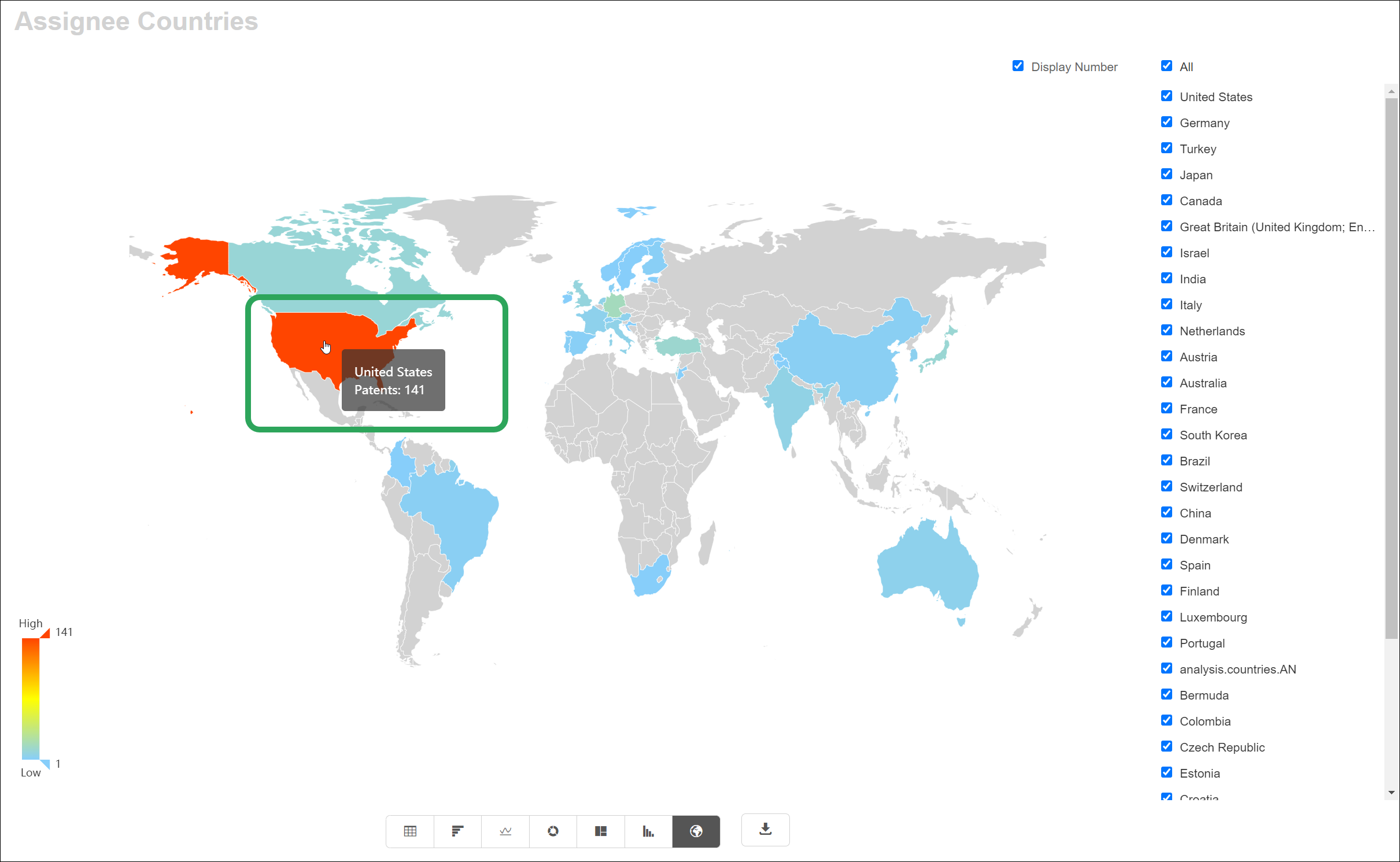
This chart shows the assignee countries for patents associated with your substance results.
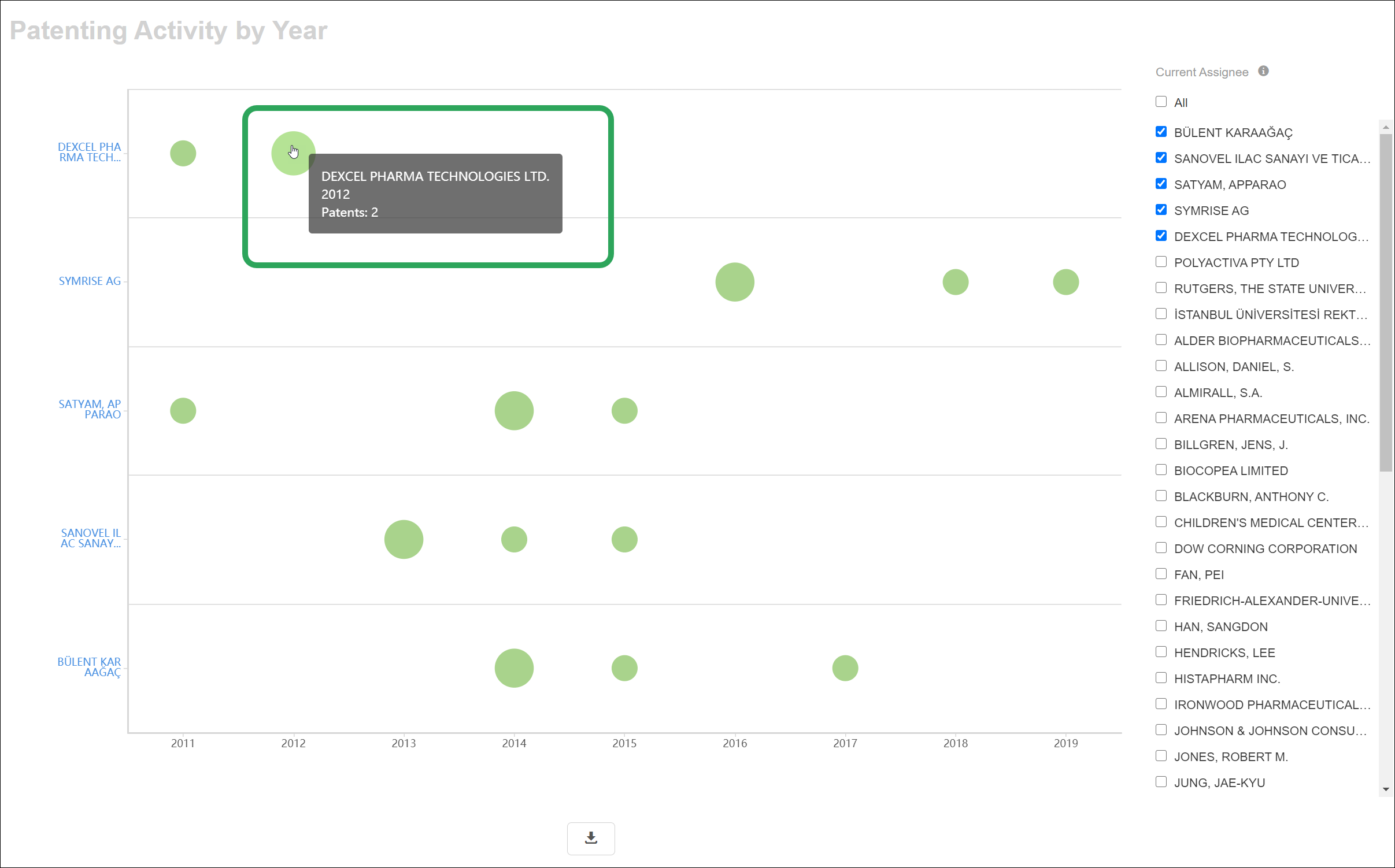
This graph shows the patenting activity by year of the top assignees for patents associated with your substance results.