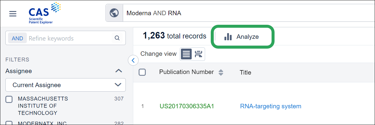
CAS Scientific Patent Explorer allows you to do a quick analysis on your results. After you've entered your search query and are happy with the results, you can analyze the results by clicking the Analyze button.
The Overview page presents a snapshot of your results in the form of 6 default charts/graphs. You can refine results by using keywords or through different filters available on the Refine tab.

Here's a quick introduction to the six default charts/graphs available on the overview page:
See "The Analysis Tab: Other Views" for more information on the other available charts/graphs.
This graph shows the top current assignees for your search query. This is critical information to have since it enables you to work out which are the companies that are most active within your field of interest. You can also make plans to work out how to combat these potential competitors or steer clear of them altogether. Furthermore, you could select assignees to get an even stronger idea of who is operating within your space of interest.
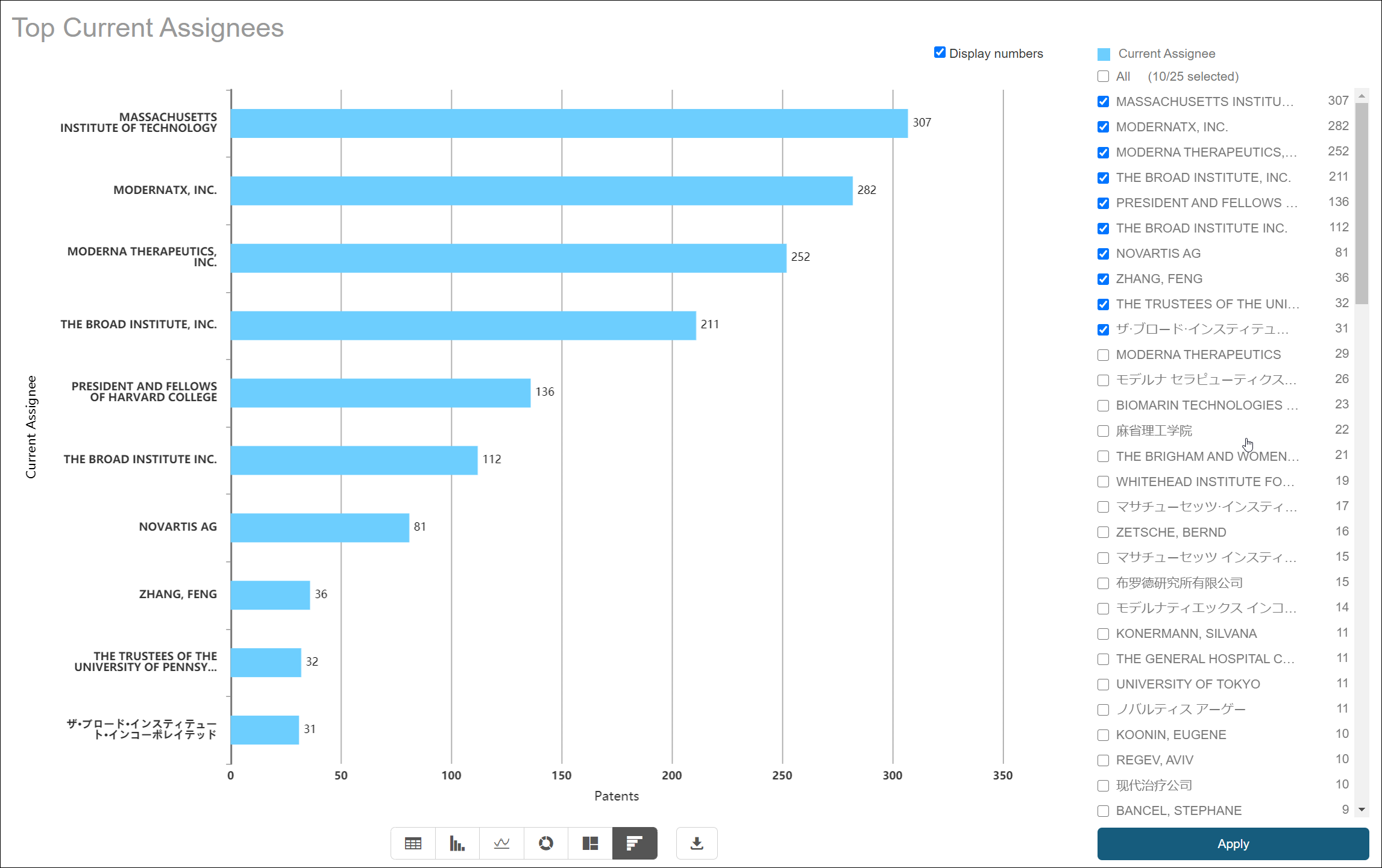
Back to Charts/Graphs Available
This graph shows the top inventors for the patent range selected. Further details can be found by clicking on the bar itself or into the relevant options section on the right-hand side.

Back to Charts/Graphs Available
This graph shows the trend of patent applications, this could be your competitor or about a field of interest over time. This information is important as it will let you know whether or not one of your competitors is becoming more active within a particular technology, which will then allow you to react accordingly.
You also have an option for "Trend Prediction", this gives a prediction of the true number of applications within the last two years for your search query. This is important as the majority of patent applications take a couple of years before the final application is published. You can also select to see only the application within a particular time frame by restricting the time frame so the chart looks less cluttered.

Back to Charts/Graphs Available
This chart shows the most common IPCs for your search results. If you are searching for a particular competitor's portfolio, this chart displays the technology fields that they are focused on. Thus, you can plan to either work against them in these particular fields or avoid them altogether.
You can also select multiple IPCs to get a more holistic view of your competitor's portfolio and see some of the more abstract areas they are working in. Additionally, you can select the level of IPCs you want to view the IPCs from, which means you can have a more general view of the technology fields that they are working in.
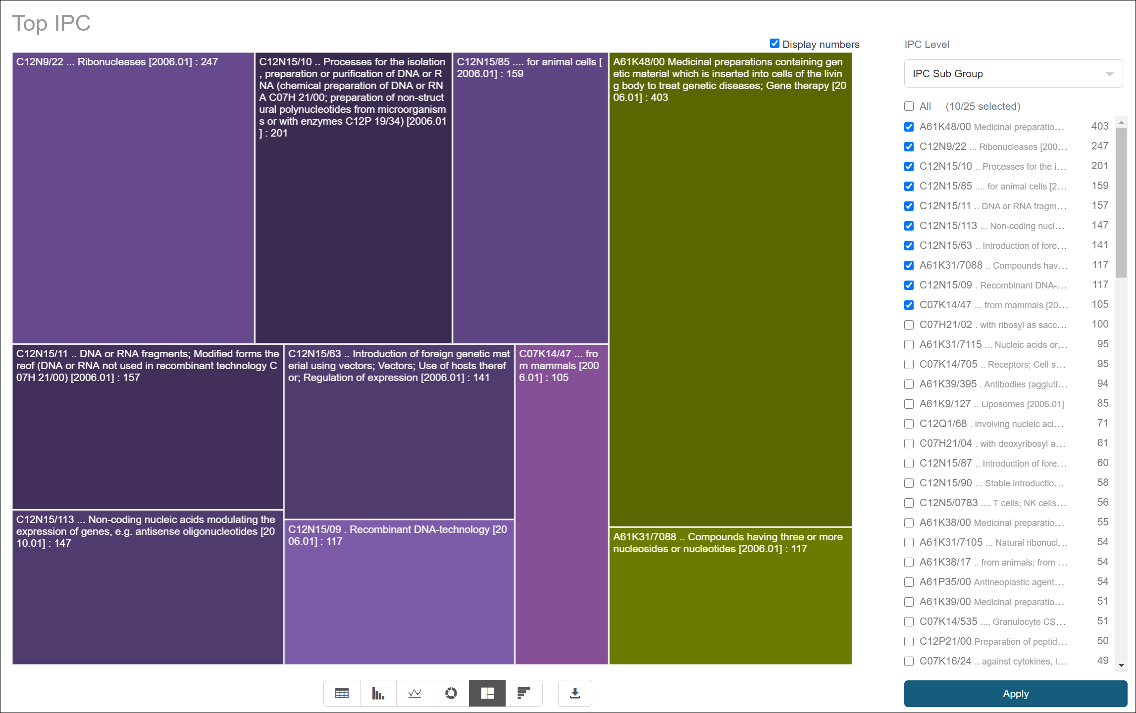
Back to Charts/Graphs Available
This graph shows the top authorities based on your search query. It shows the jurisdictions that have had a lot of patenting activity within this space and would be best to avoid. As a patent can only block your freedom to operate within the country it was filed in, you can instantly feel more comfortable from working within one which has a lower patent count.
You can also select authorities to enhance the global picture of the patenting strategy of various companies within this area.
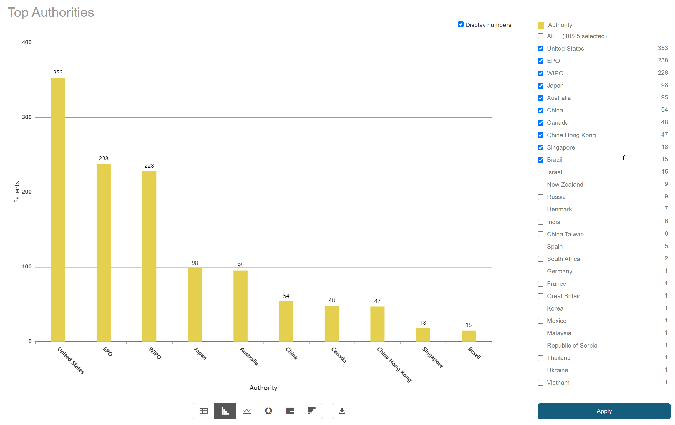
Back to Charts/Graphs Available
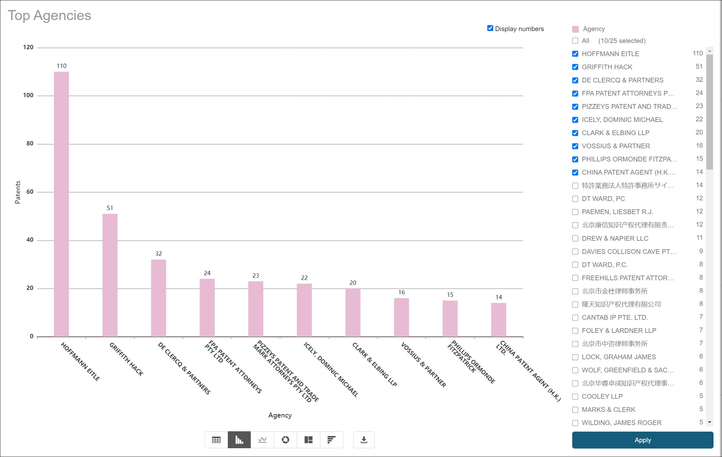
This graph shows the top agencies for the range of patents.
Back to Charts/Graphs Available